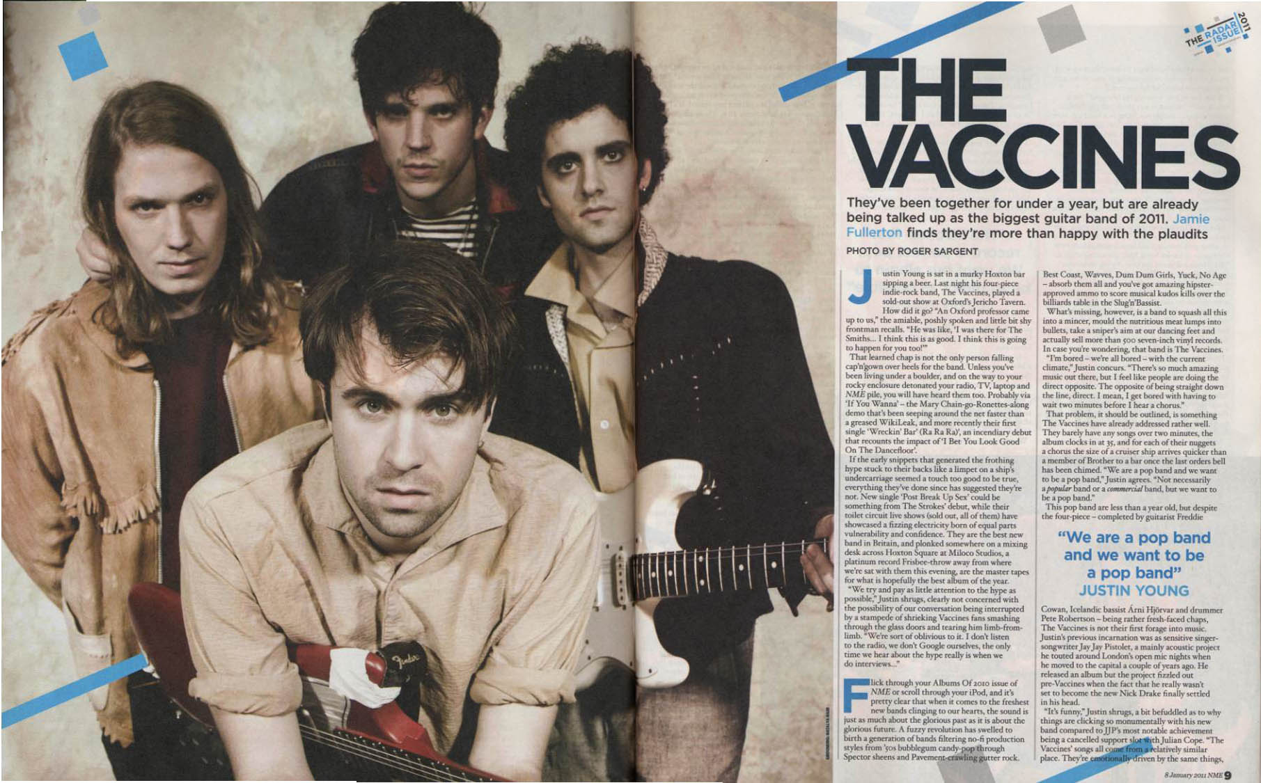
Here in this double page spread article, the layout for this is simple yet very effective. The simple use of a image consuming a large area of the spread and then a 1/3 of the article. It looks very professional and neat. There is no overloading amount of images and a sutible amount of text, just enought for the audience to read but not so much that they will get tired. The colour scheme is very effective, the baige a, black and dark red gives it a retro effect, a old feel to it, while the blue spots around the spread add colour towards it. In the text there is alot of references to other bands, that only people intrested in this genre of music would know. There is alot of referencing to them being better than bands in the critea such as The Smiths, promoting that they are truely better than them. Also it contains alot of quotes from the band itself, giving you a feel that you are speaking to them or that you know them personally. Also it gives alot of information of their where abouts in England, giving them a place you know is close and can relate to. The image is stereotypical as generally band pictures have the singer at the front, rhythem guitarist to the right, bass to left and the drummer at the back. Very rarely these posistions change unless a band member contributes more by writing lyrics etc.
No comments:
Post a Comment