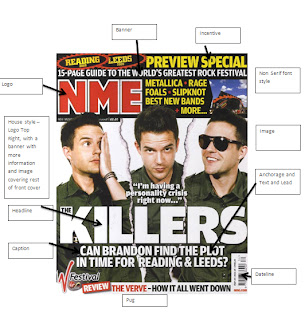
Here is a music magazine which I have analysed the features of what has been used on the front cover.
Also it has several distinctive features that stand out, such as the image has been split in three and looking like the magazine has been ripped including several different medium shots of Brandon. Also the green shirt he is wearing in the image suits the the colour scheme of magazine. Though dark colours (Dark Green and Black) have been used, the bright white, yellow and red make the magazine look bright and stand out from it's competitivers. Also the caption is a rhetorical quesiton, with not being answered the audience want to read on as not finishing a question tends to annoy the audience also it is relating the big time festivals, making the large porportion of the audience read on to see if any significant changes have happened the their festivals.Also the font seems to be very professional with non serif. Also the features is at the top clustered together with other incentives to promote festivals, this gives more room for the image and the main headline.

No comments:
Post a Comment